HOLMEN PAPER
Rebrand of one of Swedens largest paper manufacturers
The brief
Holmen paper are actually one of swedens largest forest owners, a producer of not only paper products but also renewable energy.
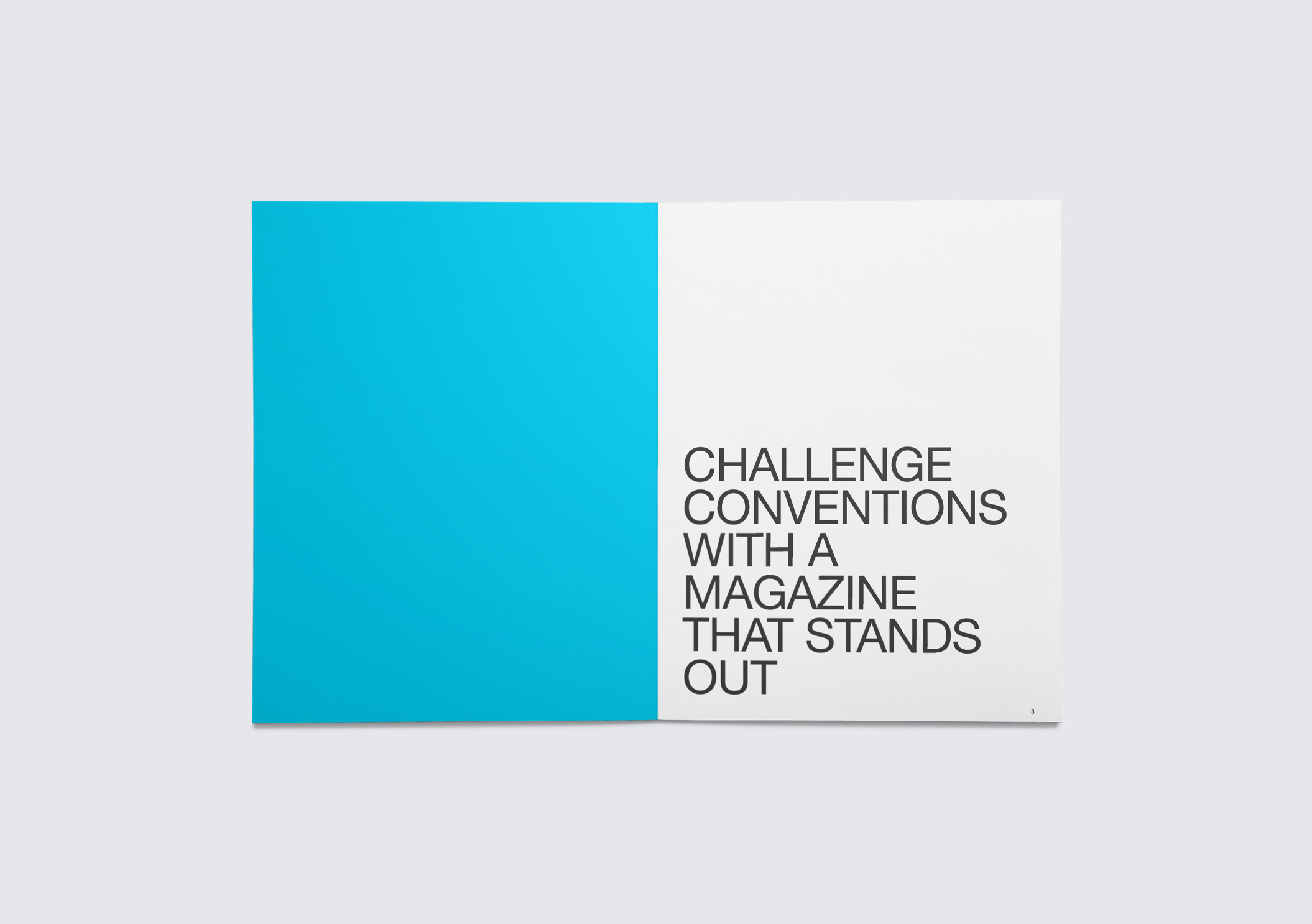
We worked on a new brand identity in order to lift the holmen profile and products to show that they are, in a so called dying industry, by far still a company with value.
The idea
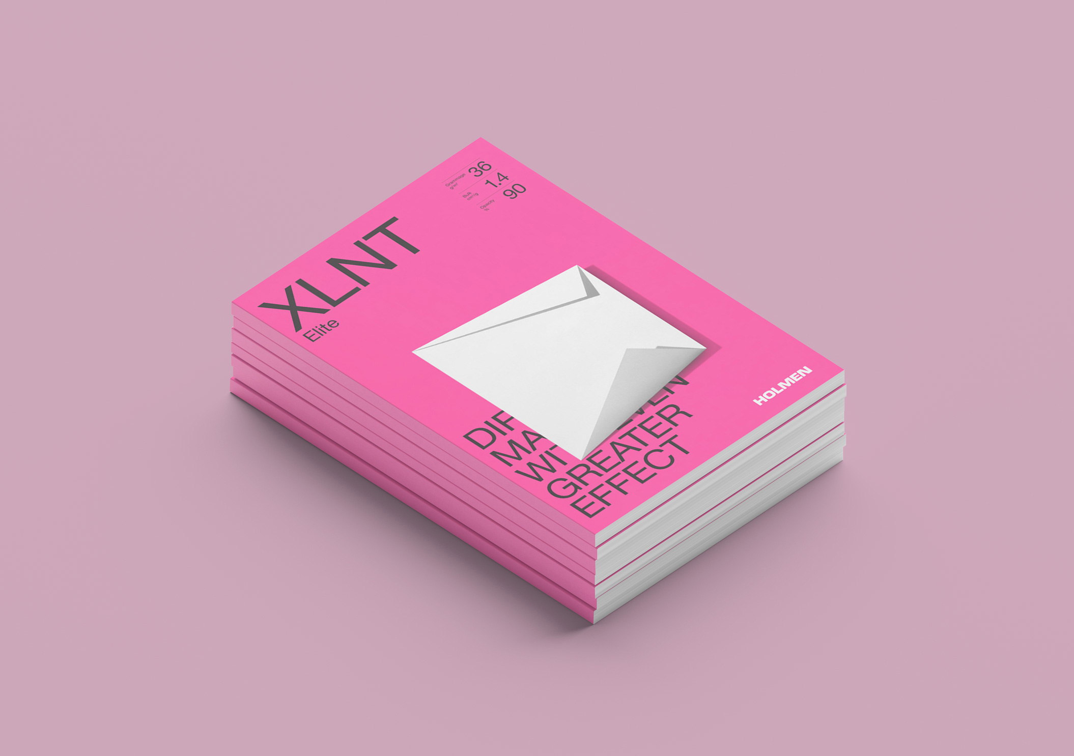
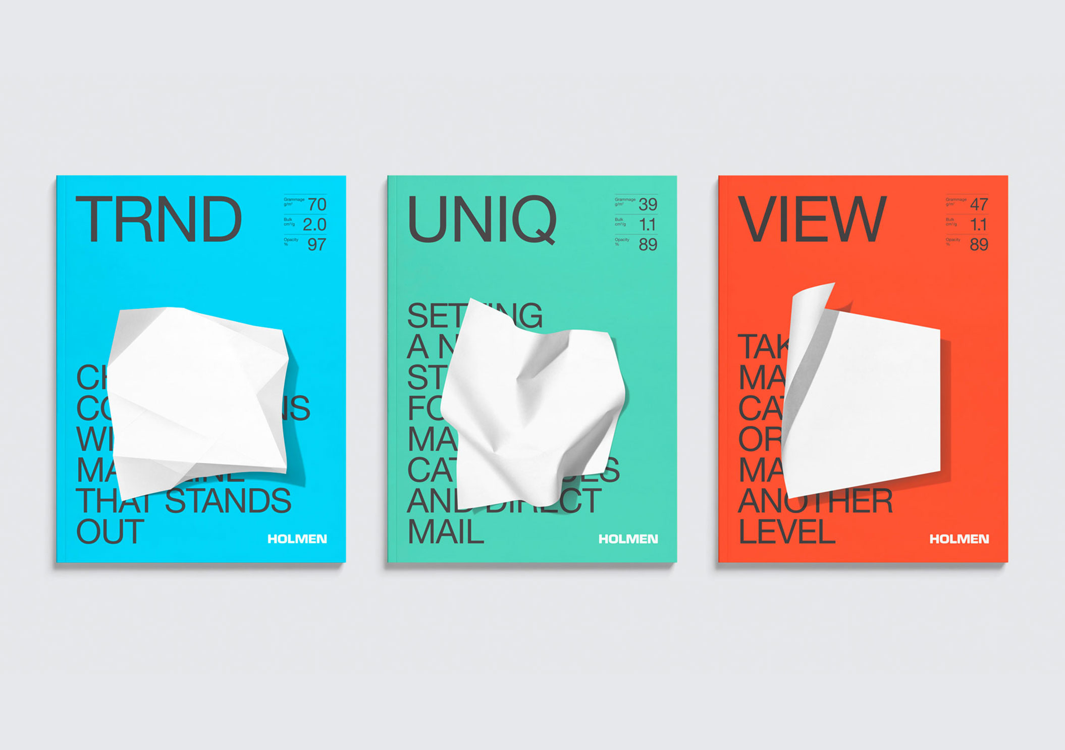
We introduced a simplistic, tactile, hands on graphic system using colour and also by shaping the paper in different ways to represent the different ranges and qualities of paper.
The result
We took Holmen Paper, from being a paper company that despite being one of the largest in Sweden remained below the radar in terms of visual appeal, to a company that showed that they were proud of what they both produce and achieve, not afraid to move with the times. A company that has so much more to give than just paper products.

MANY
OPTIONS

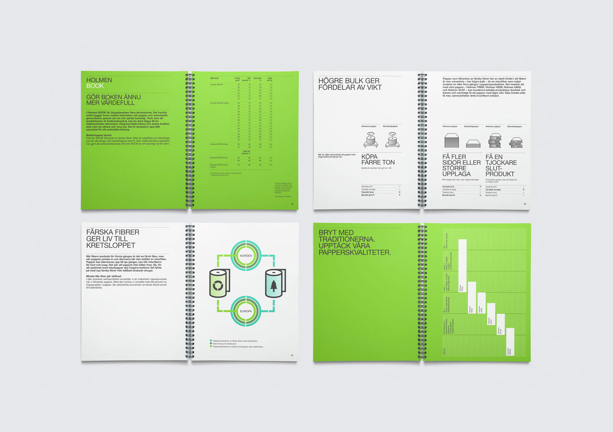
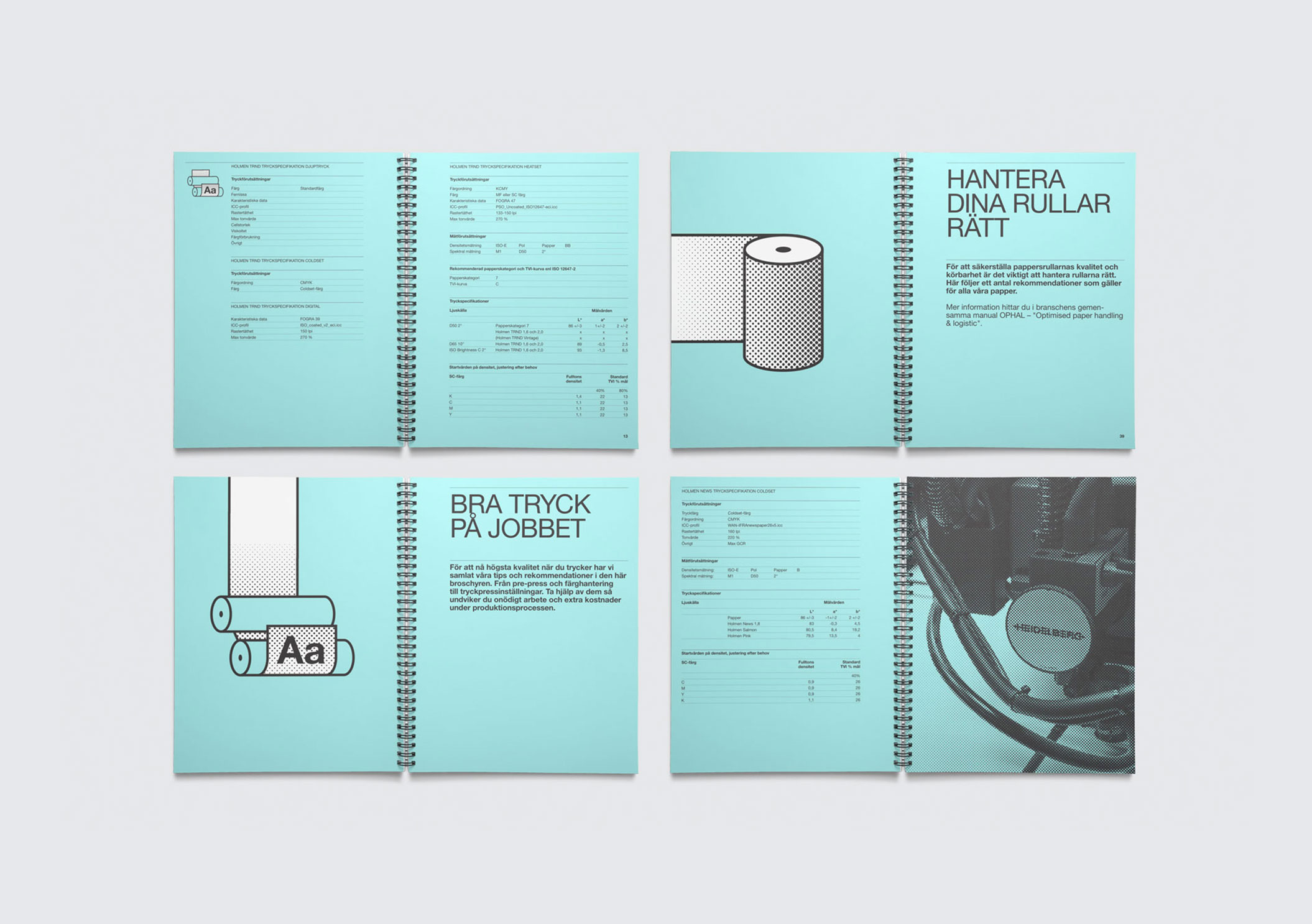
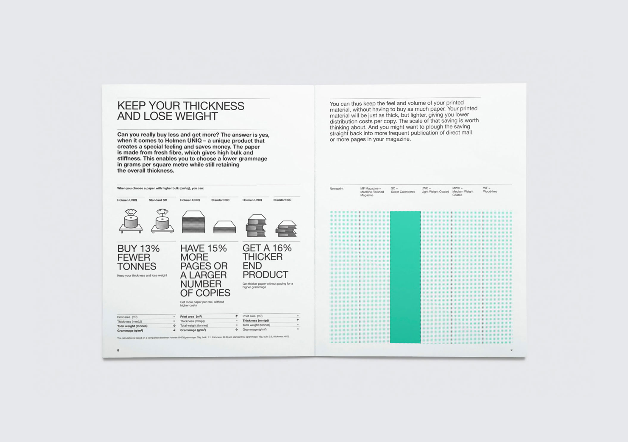
Holmens paper range is extensive so we used a simple colour system where different tints represented different weights within the range.
The way the paper was folded also reflected the tactile quality of the paper with supporting text to describe what the paper was best suited for.


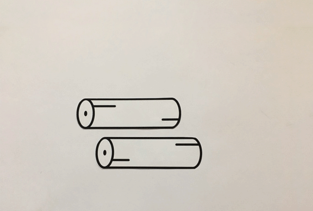
A set of animated icons were designed to bring movement and a digital presence to the identity.
These were first animated using some paper, scissors and a simple stop motion technique. They were then turned into their digital counterparts.