OKJA
HAMBURG BASED ORGANISATION THAT PROVIDE STRUCTURE AND ACCOMMODATION FOR YOUNG PEOPLE AND THEIR FAMILIES.
The brief
OKJA are a Hamburg based organisation that offers young people the opportunity to organise their free time. For many, the OKJA institutes are a central place to socialise. Kind of like a second home.
The idea
Structure and space where the foundations of this company. We wanted to create an identity that represented this strong philosophy towards their work, something that oozed stability and security.
The result
City living is tough and builds character and strength within ones self. We created a modern, youthful and confident identity that the younger population connected with and that represented the building blocks of the company.

YOUR
OWN
SPACE
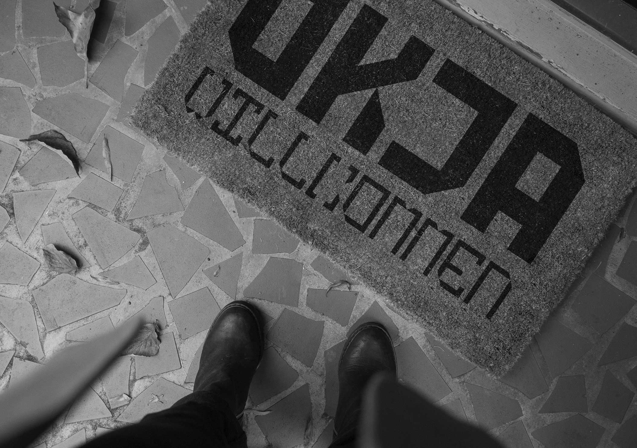
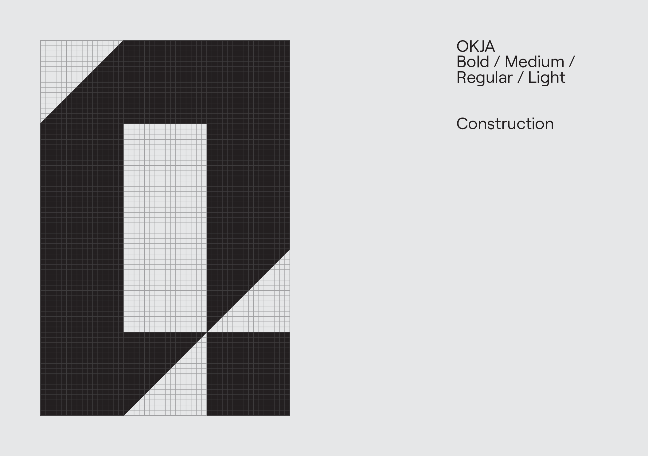
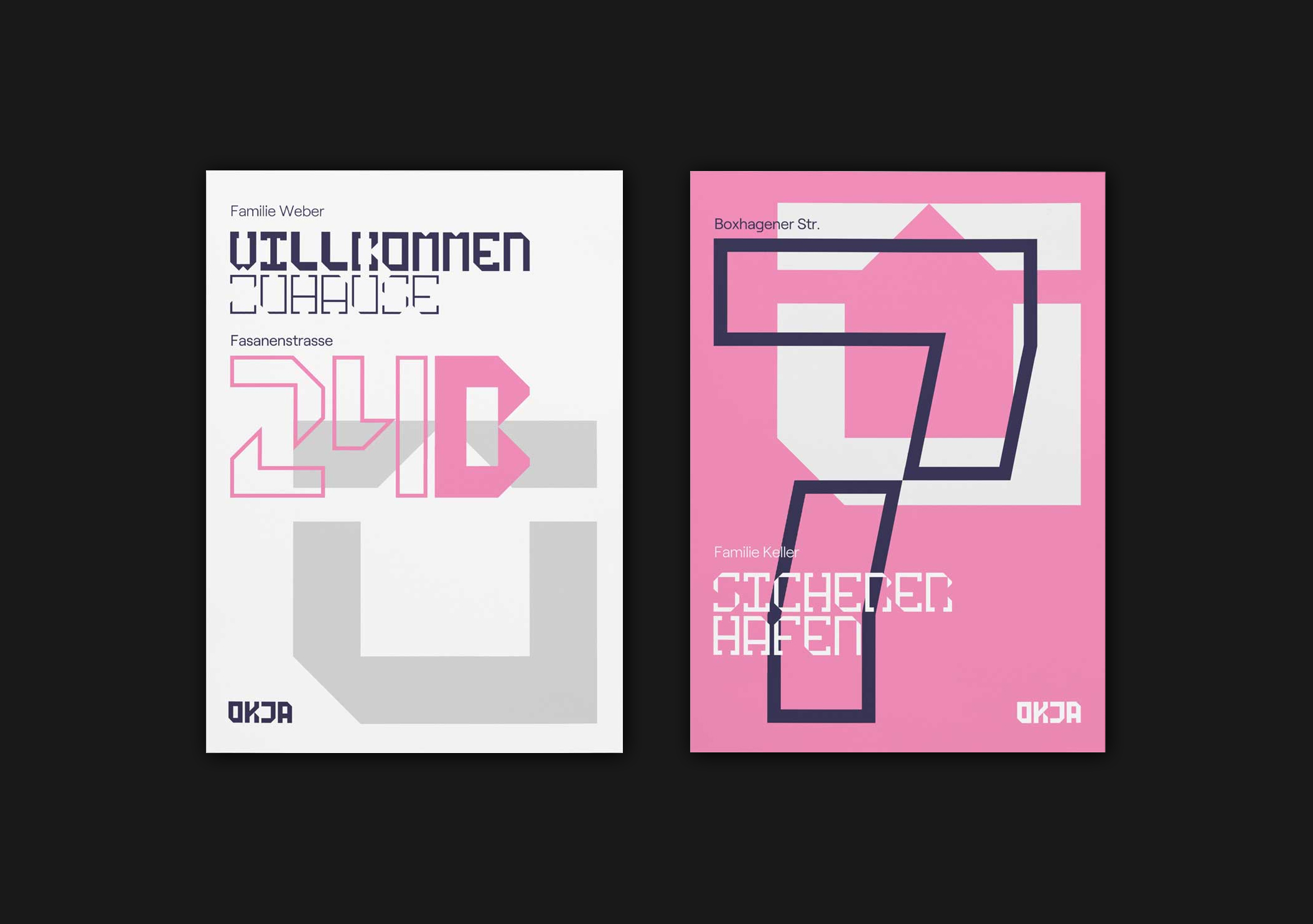
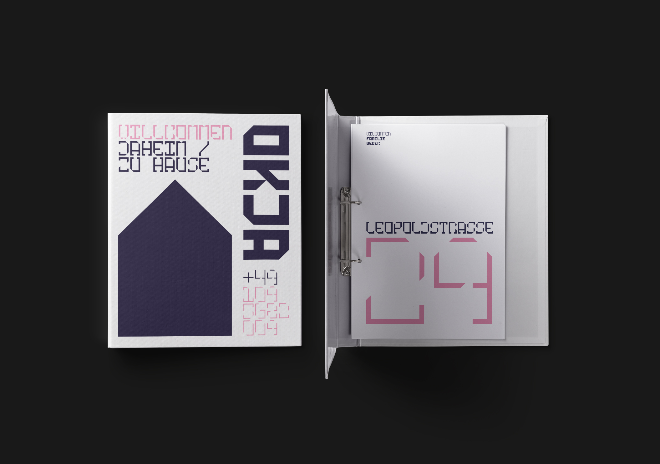
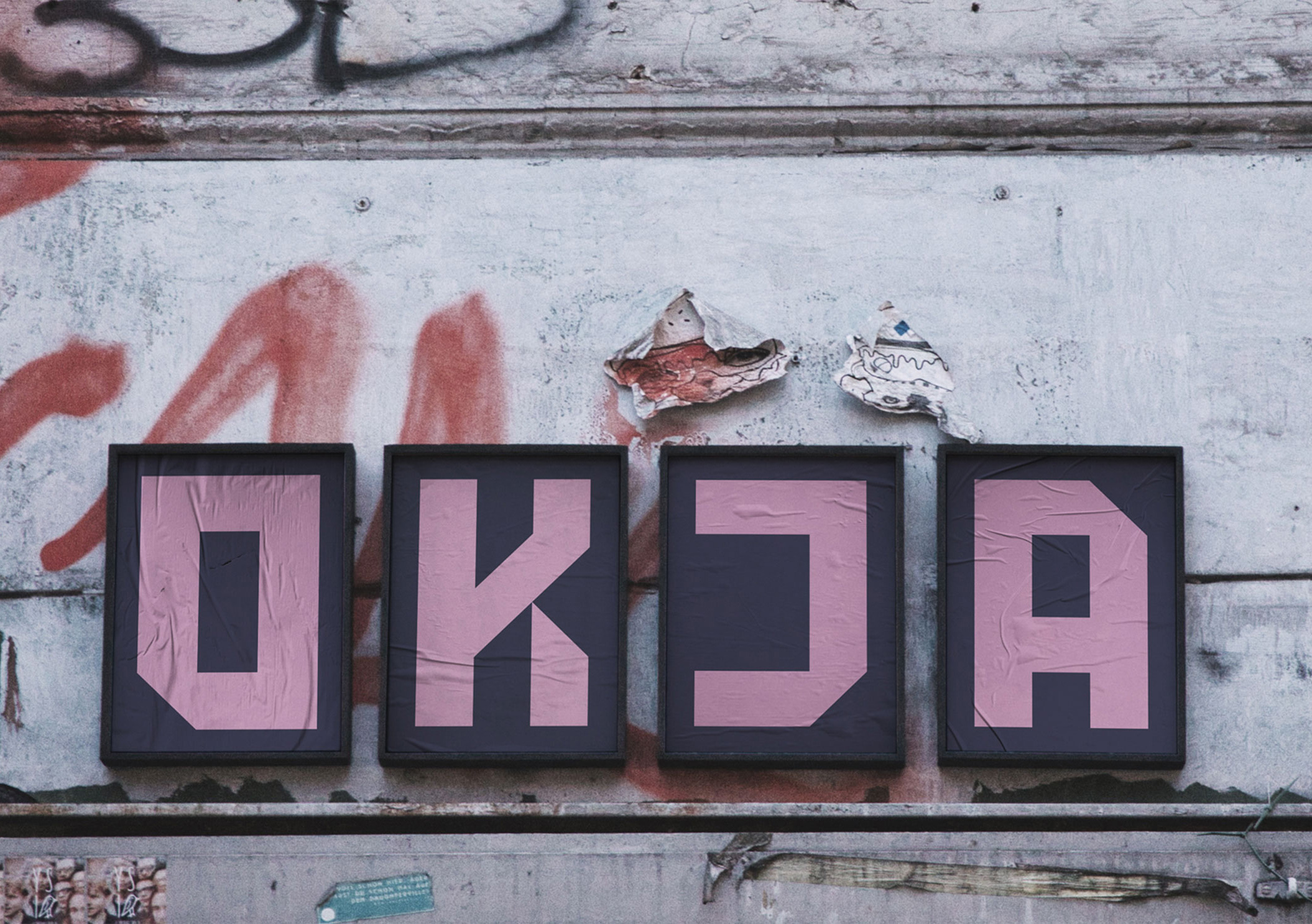
Accommodation as space, stability as structure. These inspired us to create a simple logotype that is instantly recognisable, one that has a ‘stamp’ or ‘stencil’ like look and feel, the language of the street.


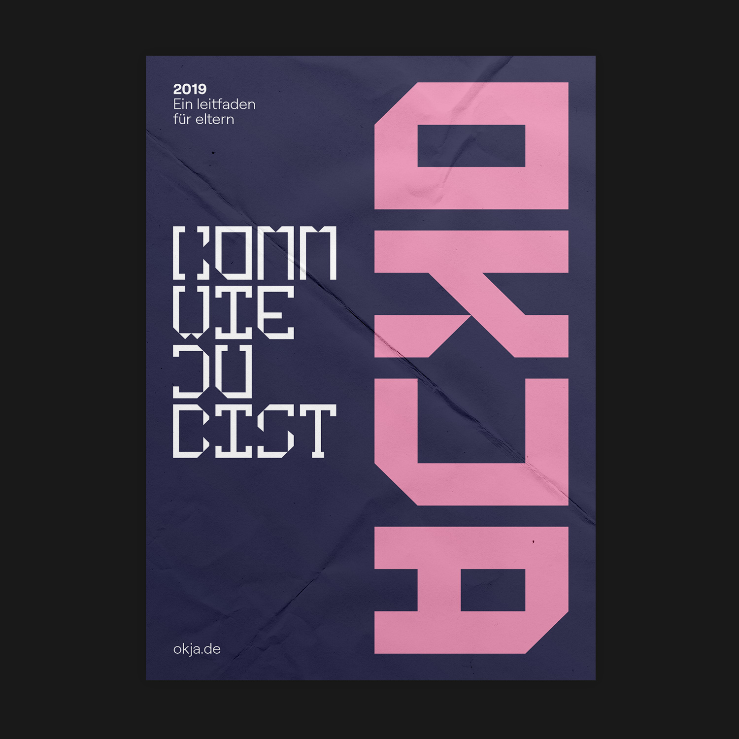
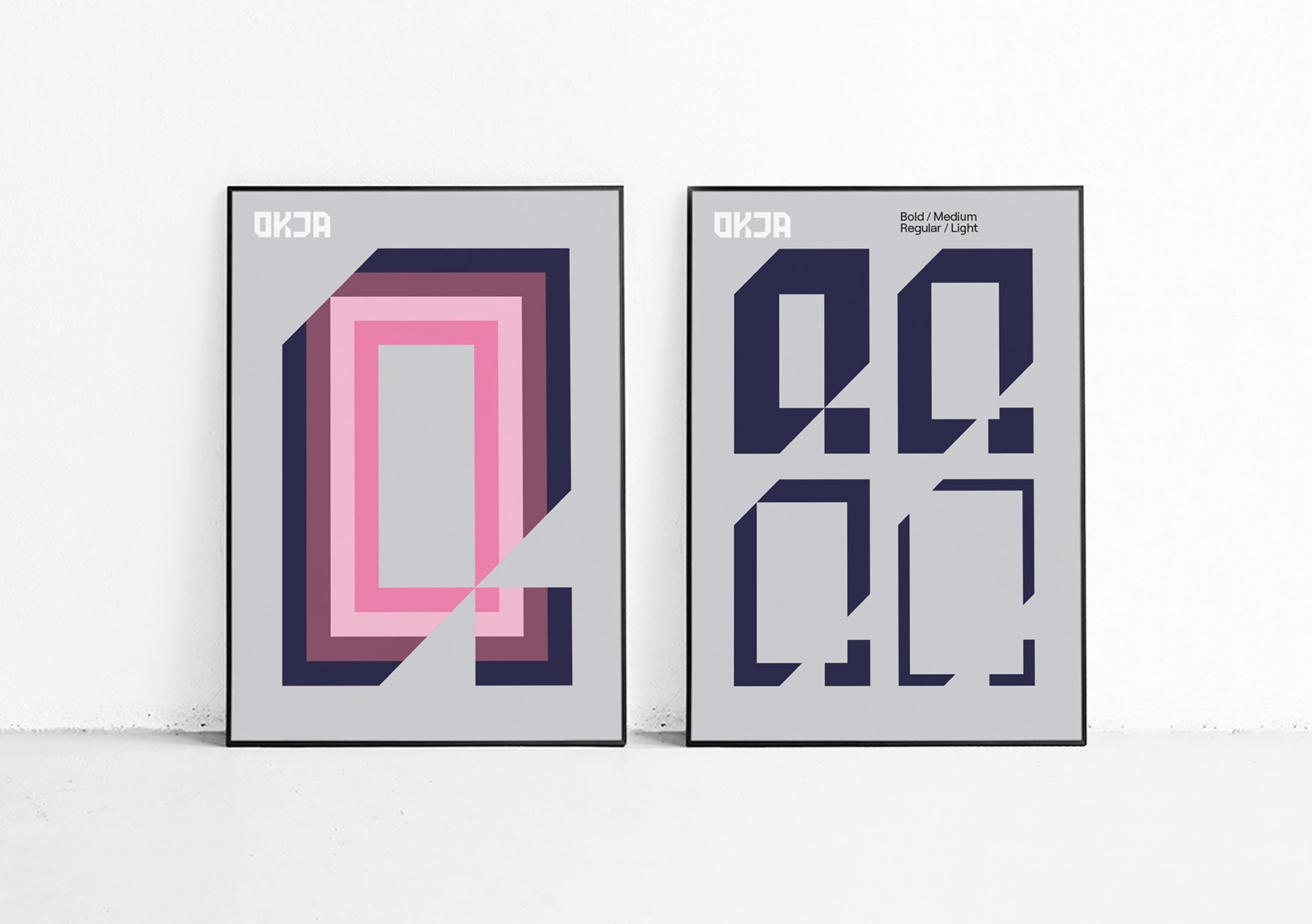
We designed a custom display font based around the concept of internal spaces and influenced by the architectural plans of houses. This was then used throughout all types of communication.