Folk Remedies are a Swedish, New York based herbal oil company.
They required a new packaging concept for their new range of essential oils.
![](https://usercontent.one/wp/www.matthewsquire.nu/wp-content/uploads/2020/01/Folk-Remedies-logo.gif)
![](https://usercontent.one/wp/www.matthewsquire.nu/wp-content/uploads/2020/01/Folk-wall.jpg)
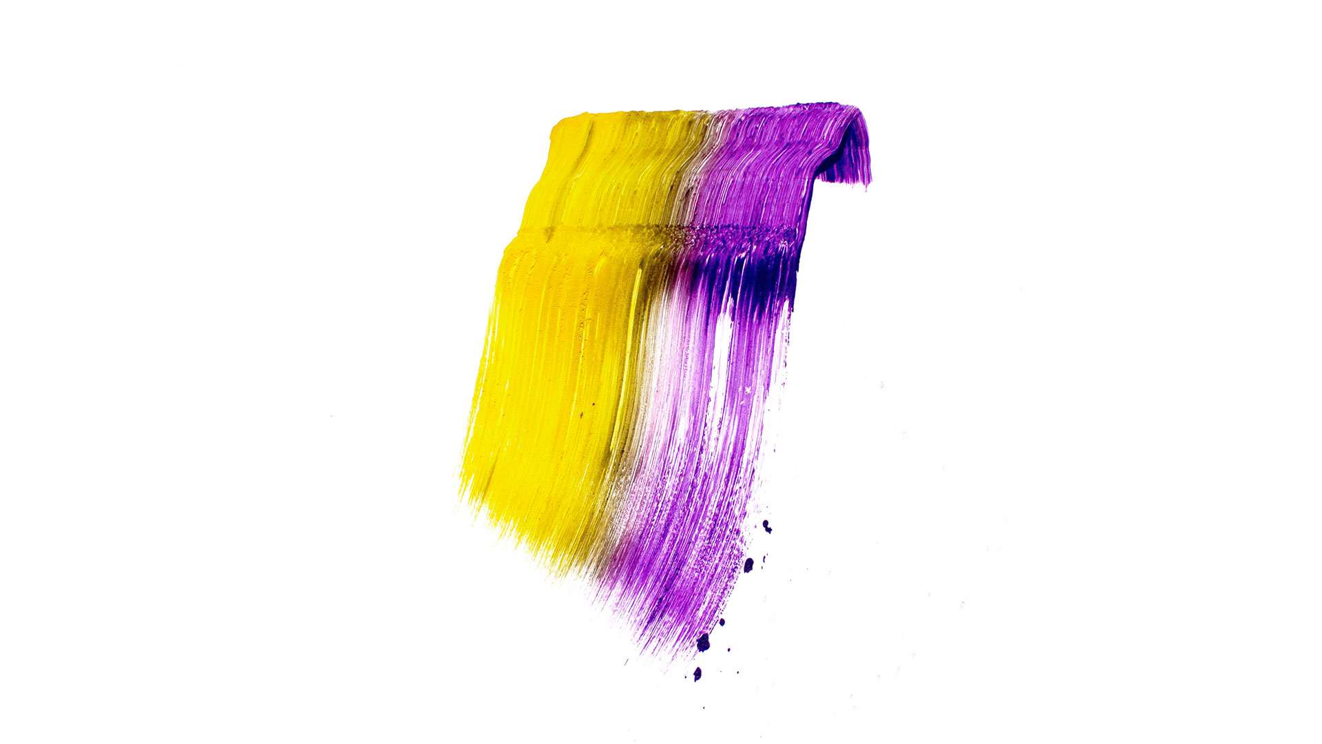
True to our nature we started hands on, exploring shapes and patterns that could reflect the feeling and wellness that the oils gave you.
![](https://usercontent.one/wp/www.matthewsquire.nu/wp-content/uploads/2020/01/Folk-remedies-sketch-2.jpg)
![](https://usercontent.one/wp/www.matthewsquire.nu/wp-content/uploads/2020/01/Folk-remedies-sketch-1.jpg)
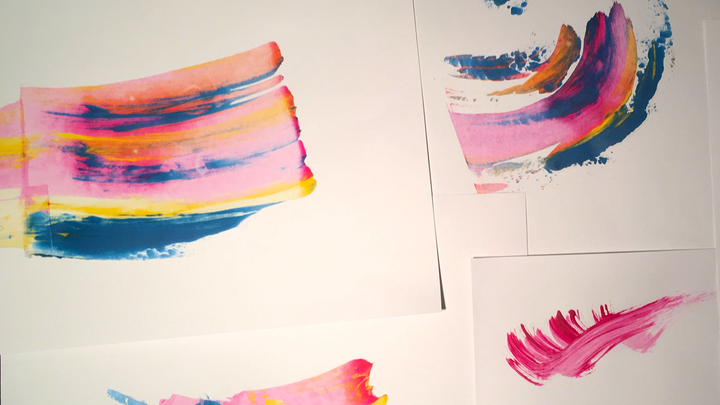
After researching the style of illustration we were after we then sourced XXX to create a series of patterns that we could apply to the packaging
![](https://usercontent.one/wp/www.matthewsquire.nu/wp-content/uploads/2020/01/Folk-bottles.jpg)
![](https://usercontent.one/wp/www.matthewsquire.nu/wp-content/uploads/2020/01/Pitta.jpg)
![](https://usercontent.one/wp/www.matthewsquire.nu/wp-content/uploads/2020/01/Vata.jpg)
![](https://usercontent.one/wp/www.matthewsquire.nu/wp-content/uploads/2020/01/Folk-bottles3.jpg)