ASPIA
WE DESIGNED THE IDENTITY AND PACKAGING CONCEPT FOR THEM

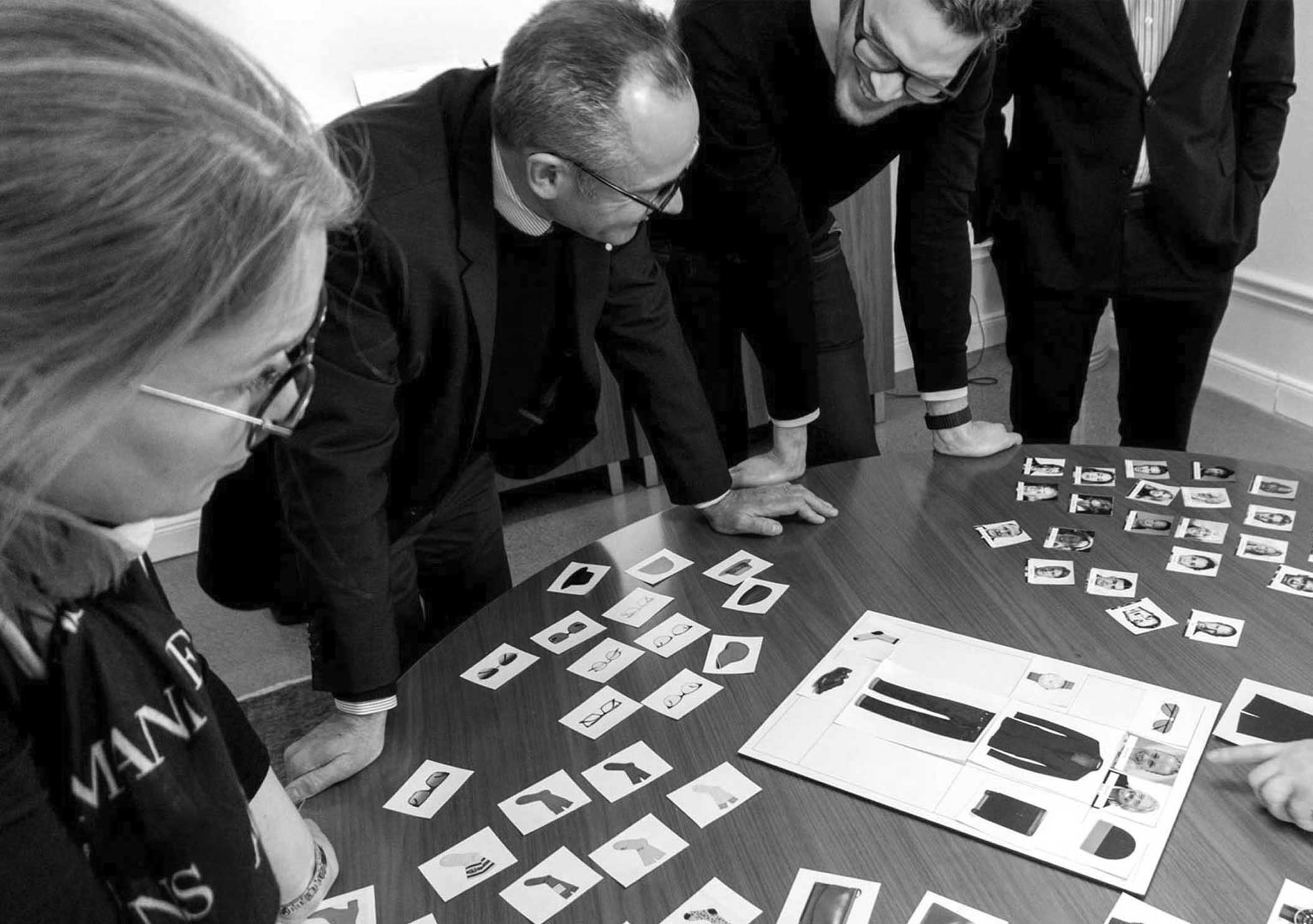
The brief
Aspia are an off shoot of PWC that deal specifically with book keeping. They were looking for a brand identity, both visual and strategic, that would retain customer loyalty whilst elevating the brand forward in a modern yet serious way.
The idea
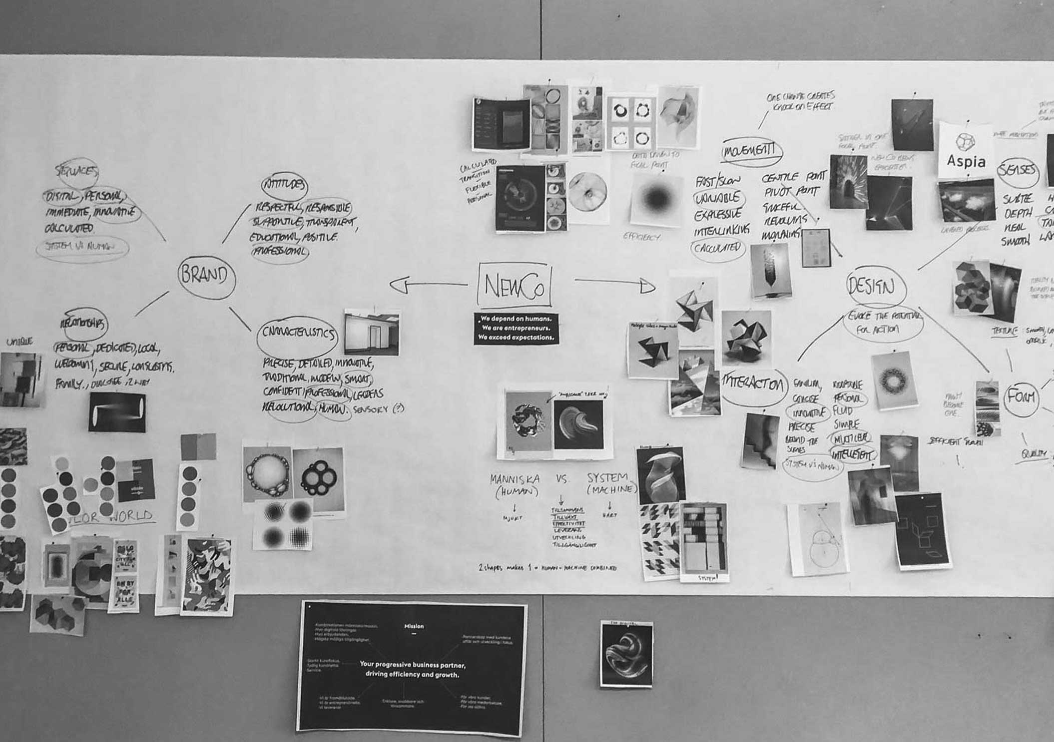
It was apparent to us after rounds of strategic workshops that Aspia wanted to steer clear of the cliches attached to the financial world, to modernise the way customers view book keeping, and make it exciting. With this in mind we would create a modern, fresh, engaging identity, based around the idea of growth and efficiency.
The result
Aspia can confidently stand on their own now amongst the largest of competitors. Their link to PWC is something that purely exists in the past whilst their new identity is one that is built with the future in mind. An identity that has huge digital potential and one that does indeed, make book keeping sound almost fun.
GROWTH
THROUGH
EFFICIENCY
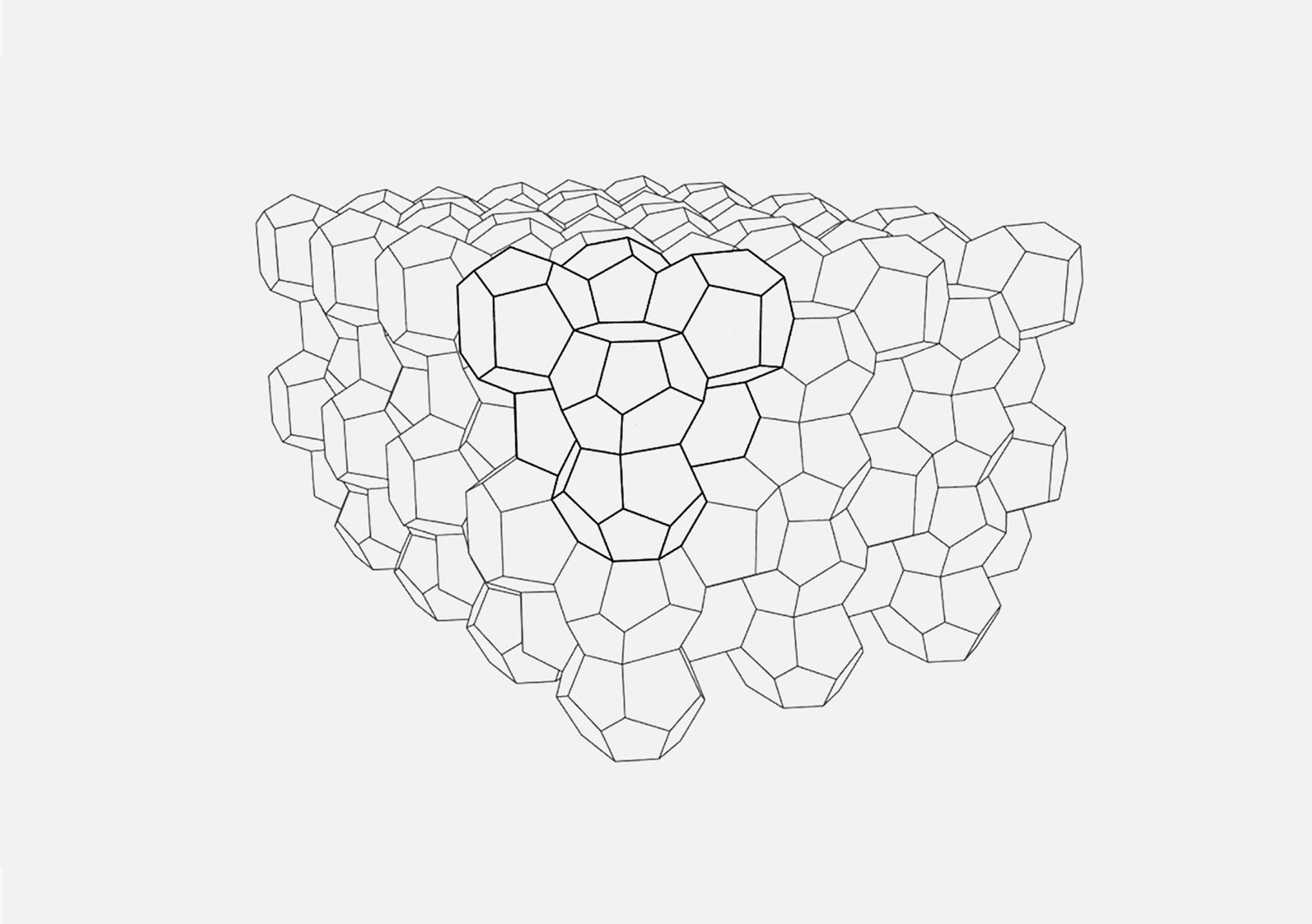
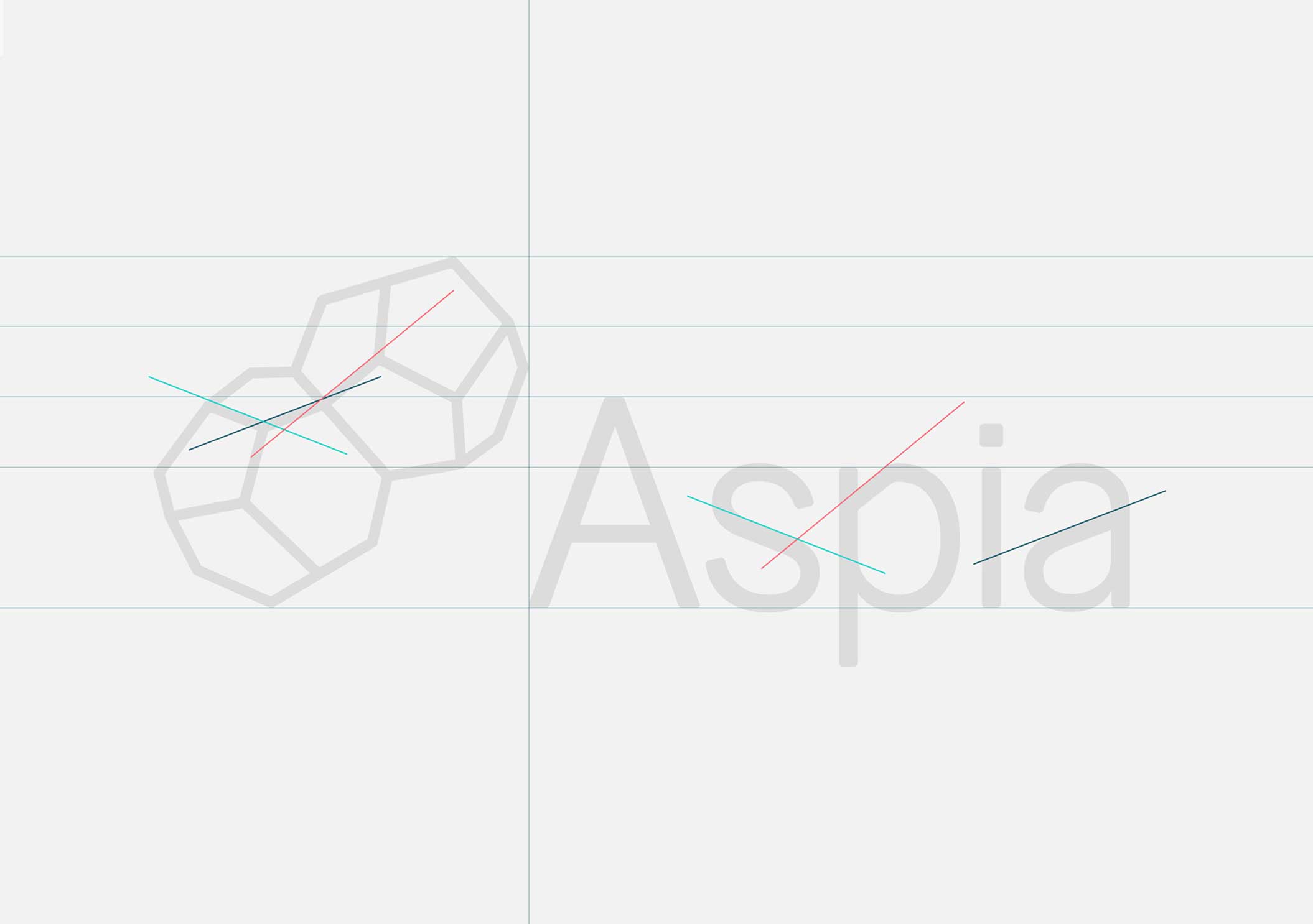
‘Growth through efficiency’ emerged as the the key foundation of Aspia through the many workshops we ran. After some research we stumbled across the weaire-phelan structure, to date, the most efficient bubble structure known. What made this structure so interesting was that it comprised of two different cells of equal volume and when joined together, literally, grew in the most efficient way possible.
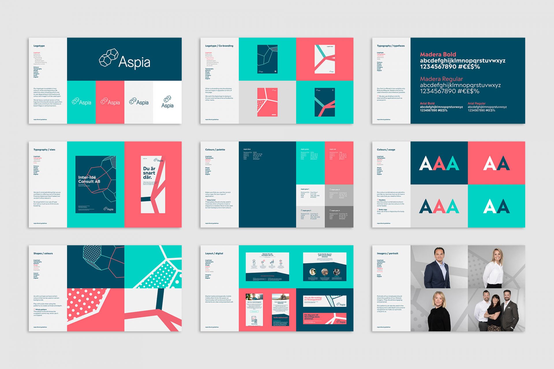
This structure gave us ‘our’ foundation on which to base the whole visual identity upon.

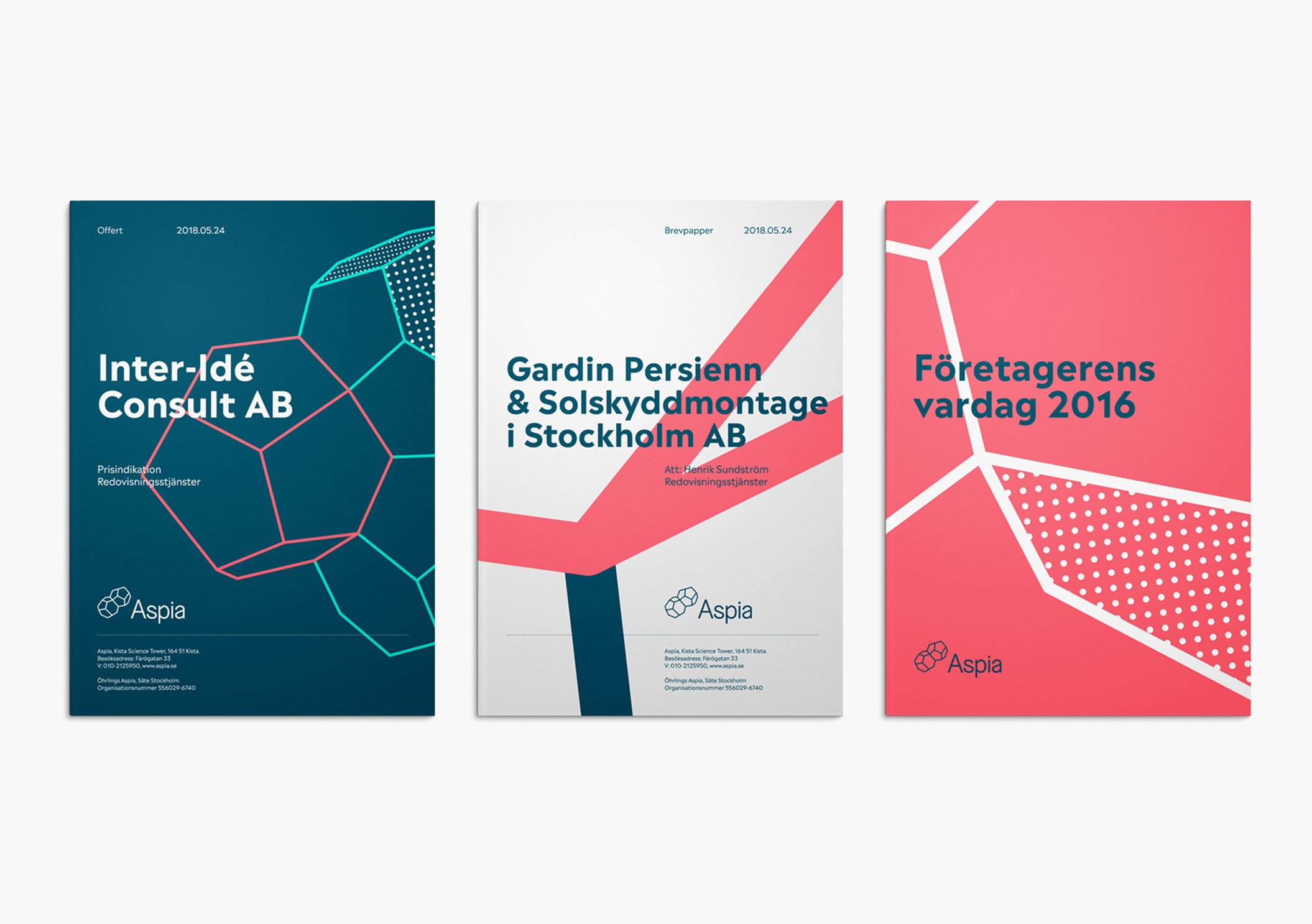


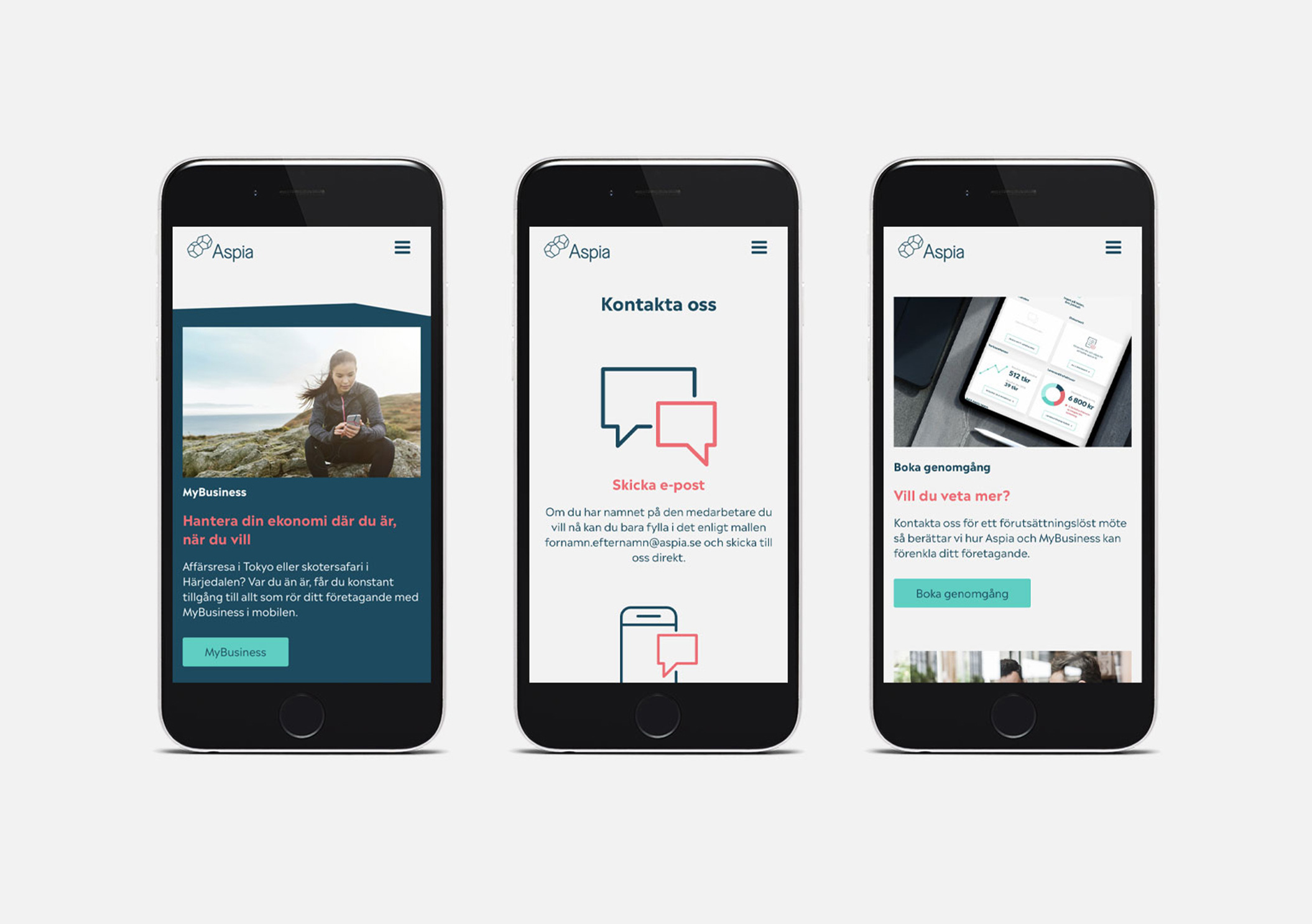
The mark was used throughout digital media, being used as a path that connected, communicated and transferred data, along the lines of efficiency.

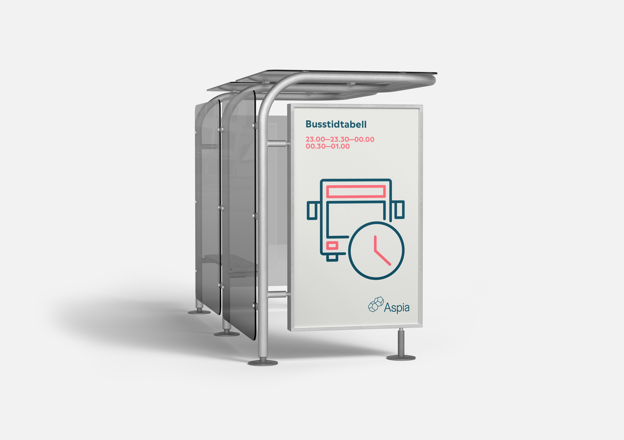
It’s not all numbers and serious business, they also asked us to have a bit of fun when it came to the material for their brand launch party. Posters, bus timetables and everything else you need at a party was treated as brand material, just with the ‘tongue in cheek’ dialed up a little.