AIMI
FUTURE PROOFING THE FUTURE, BUT KEEP IT SIMPLE!
The brief
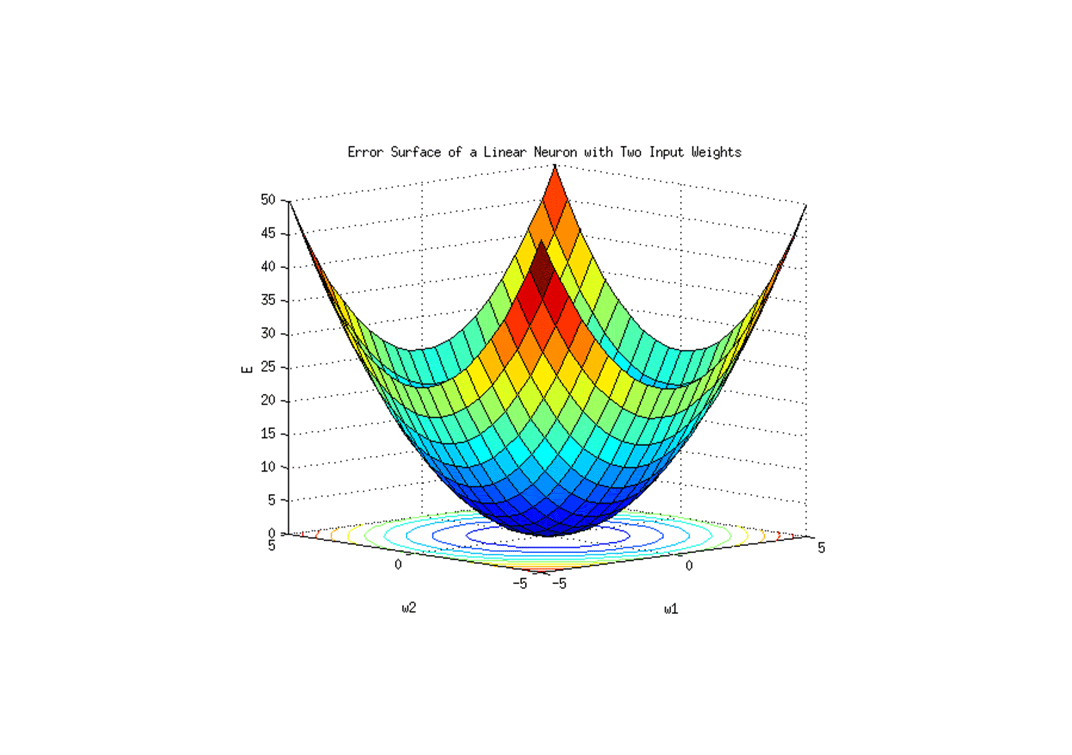
Aimi are a digital company that help their customers take the required steps in order to make their future operations and products, data-driven and ai enabled. They call this process ‘gradient descent’.
We were asked to give aimi a face, an identity that on face value simplified thie complex thinking that goes behind the model.
The idea
In the world of ai the word ‘descent’ is actually a positive term, relating to the minimal error and minimum function. In basic terms, get something done as quick as possible with minimal errors. The details into how this works can be to most a very complicated concept to comprehend.
Due to the complexity of the thinking behind this model, it was important for us to create an identity that reflected a simplistic idea of it.
The result
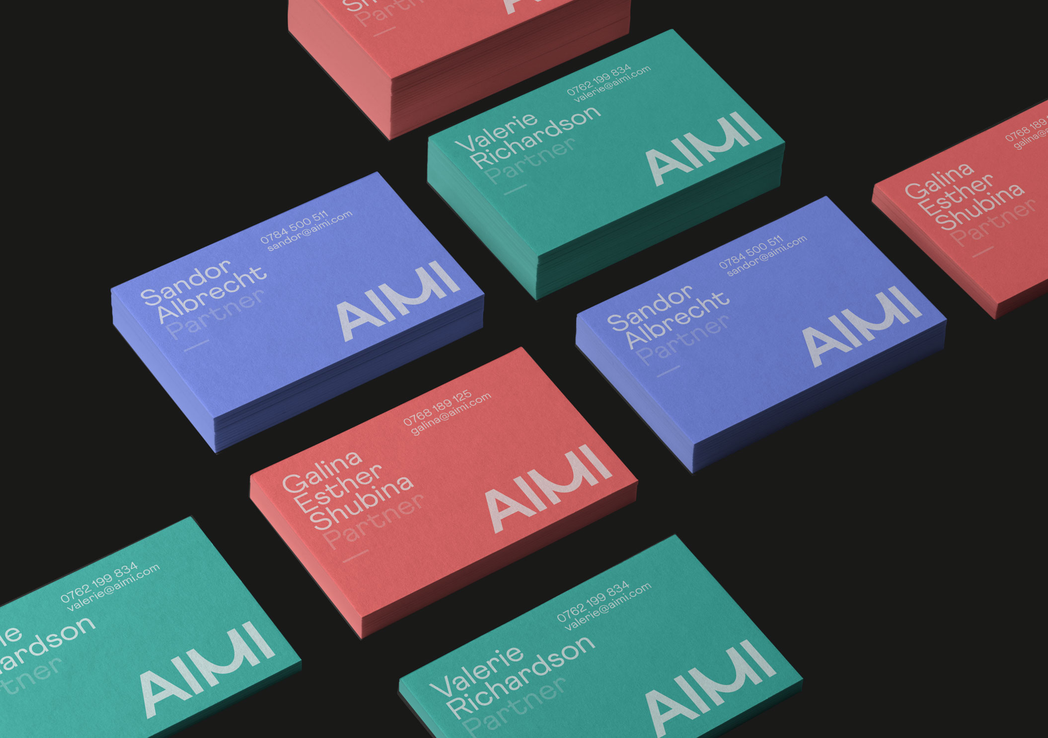
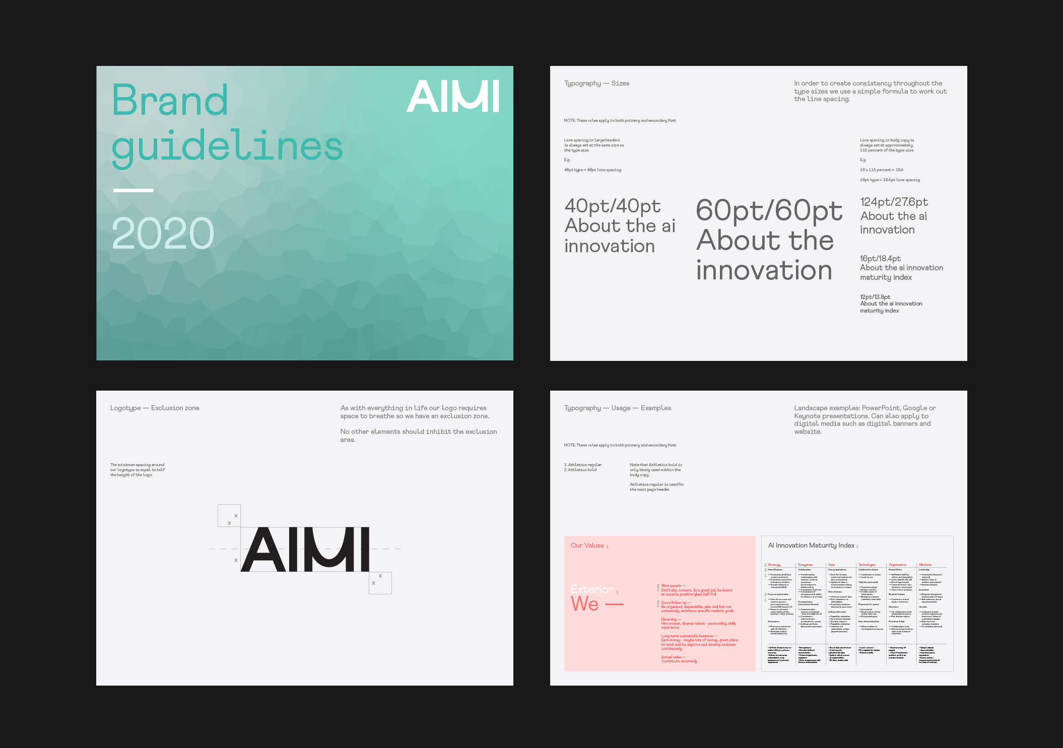
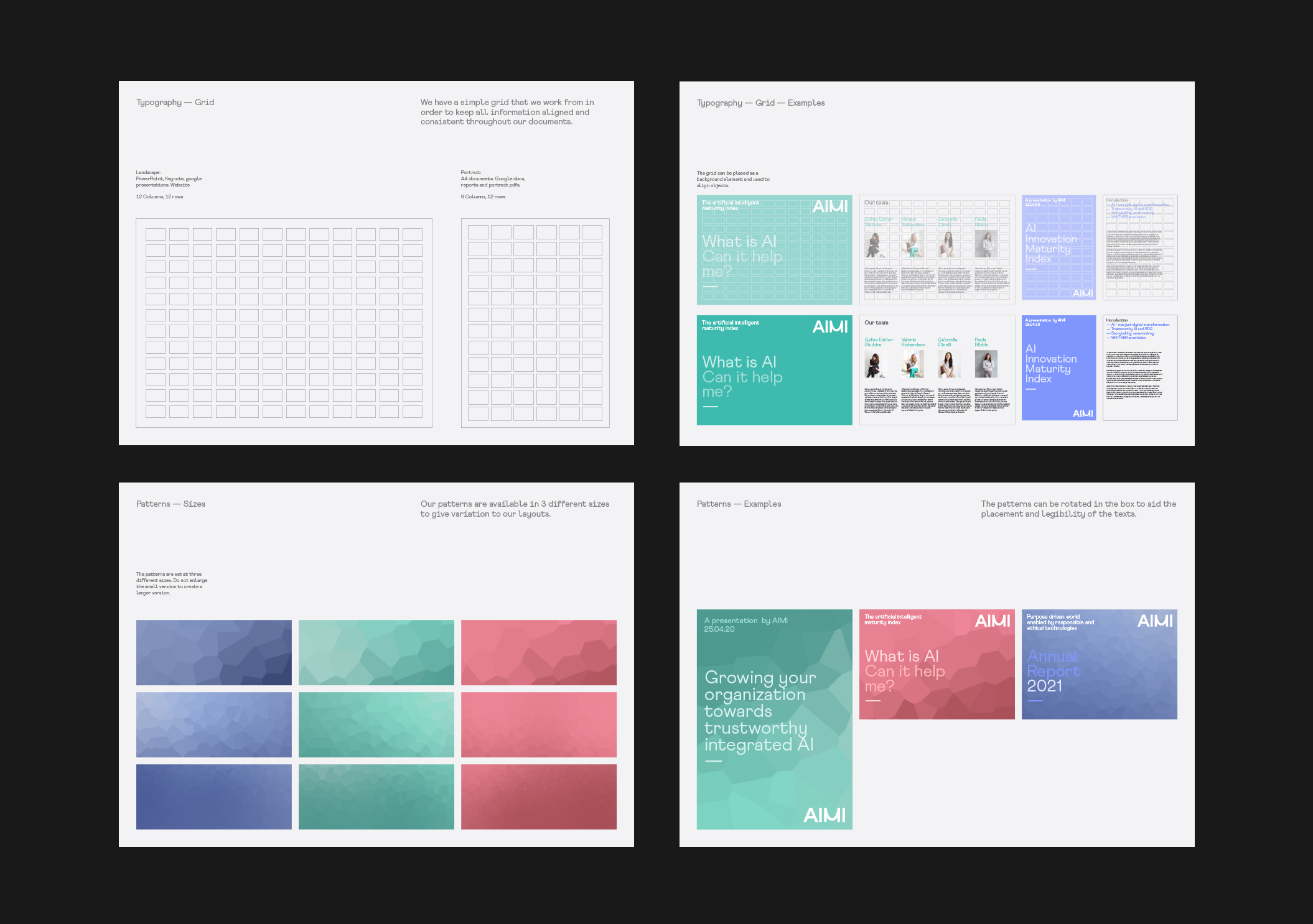
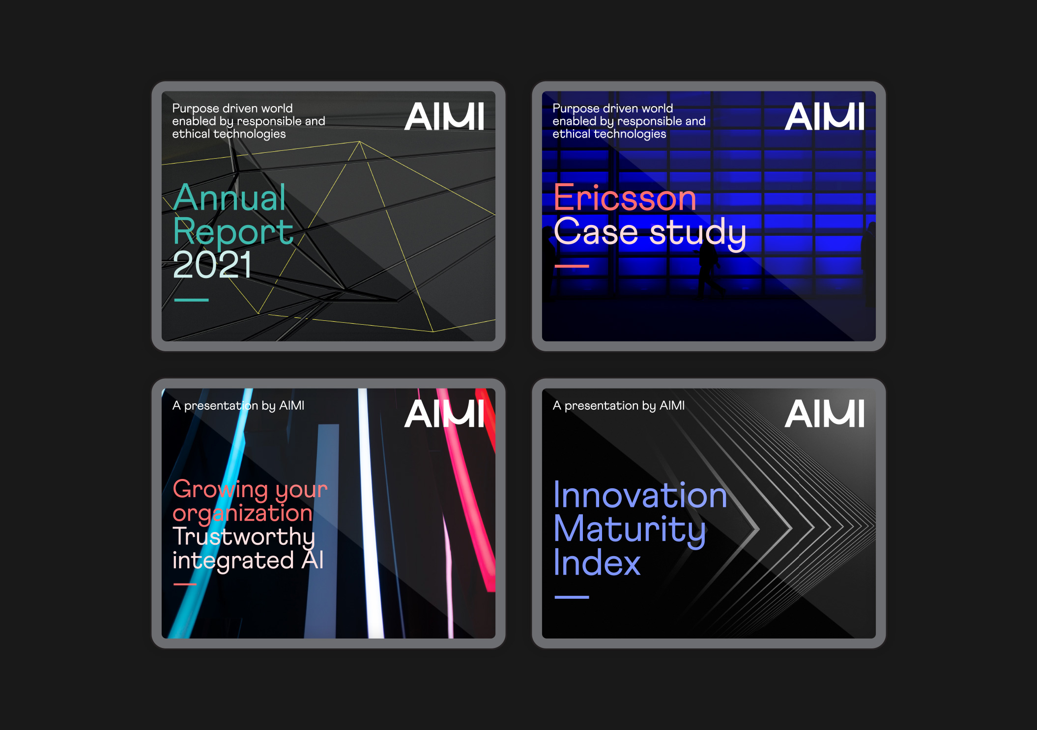
We designed a simple set of building blocks, a single typeface, a colour palette of only 3 colours and 3 types of visual patter in the three colours which are all applied to a simplistic grid system.
These elements meant that it was very easy for aimi to reproduce their own documents and products, freeing up their time to focus on the more complex issue of gradients.
DESCENT IS
A POSITIVE
THING


A simple grid system and set of guidelines was produced to further simplify the thinking behind gradient descent.