OCTAPHARMA
MOSCOW
A BOOK TO DOCUMENT THE STORY OF THE BUILDING THAT OCTAPHARMA OCCUPY IN MOSCOW.

The brief
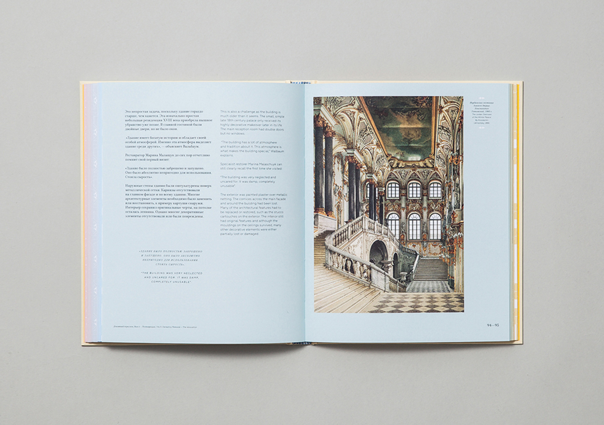
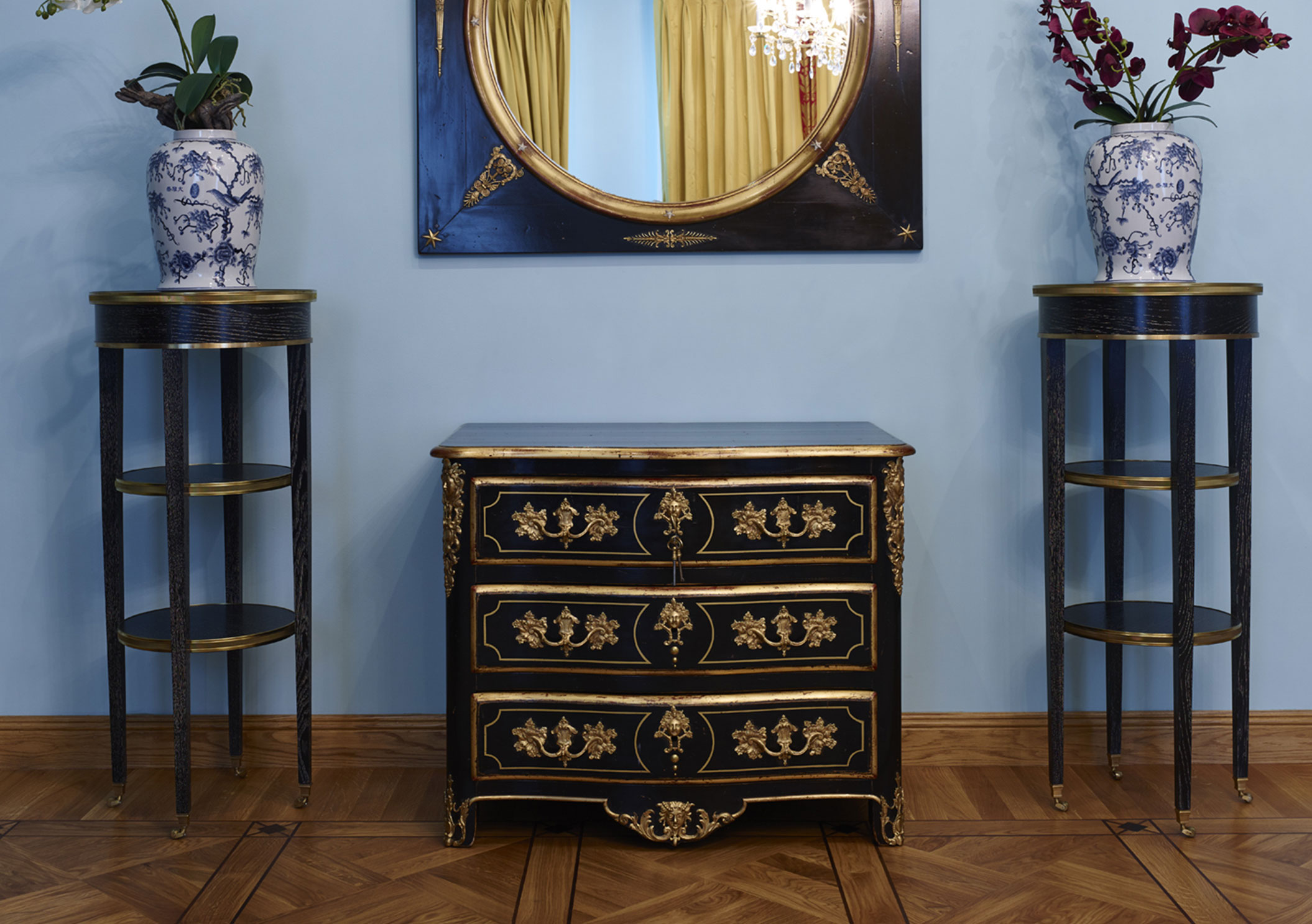
Shortly after designing and producing the book for the stockholm office, they once called on our services to design a similar book for their moscow office. In terms of history, this building couldn’t have been more different. Octapharma wanted a book that reflected this buildings unique and adventurous history.
The idea
If buildings could speak then this one would surely have a story or two to tell, a building that had witnessed and survived many wars. Gone through many changes and lives to tell the tale. The brief was simple, tell its story.
The result
This building has stood the test of time and continues to do so, and it was time that inspired us for the design of this book. We wanted to design a book that physically and visually represented the passing of time. All the elements used within the book were inspired by the house itself, from the typefaces and colours used to the illustrations and binding of the book.

COLOUR
THROUGH
THE YEARS

The building had changed colours throughout the years. We took this and gave it meaning, that being the passing of time.
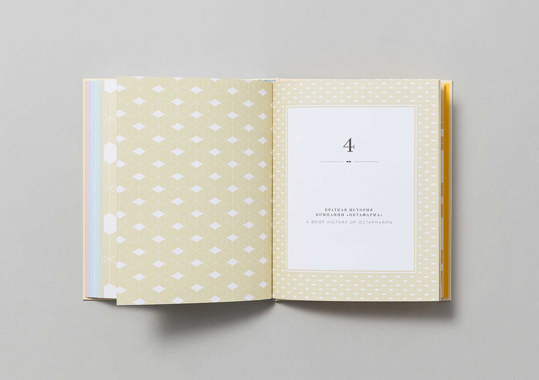
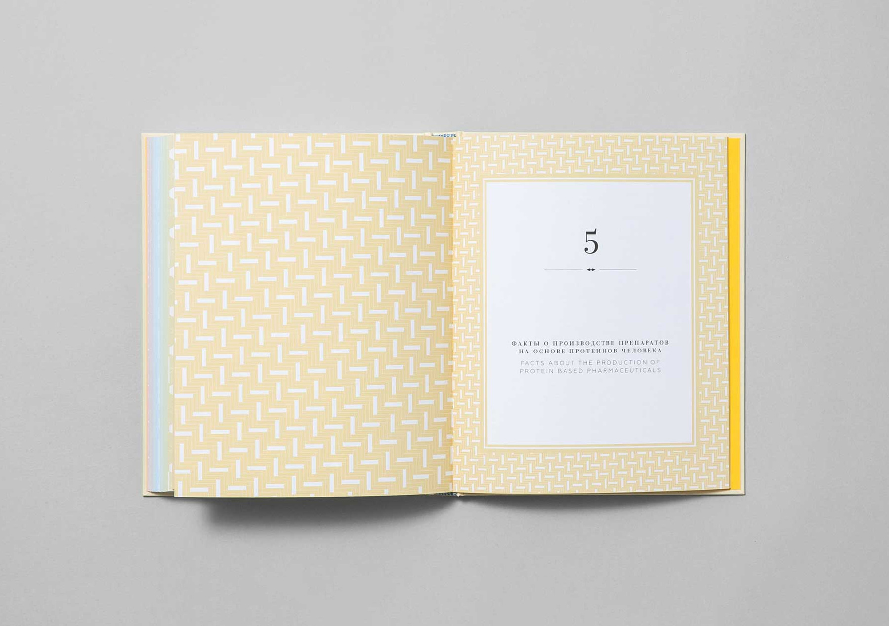
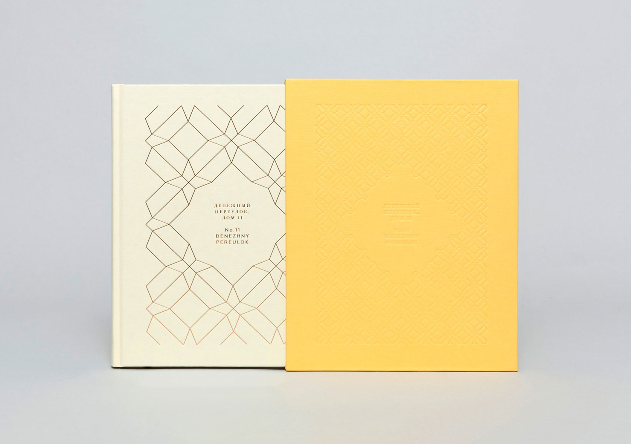
Every page in the book was a given a different background colour, creating a gradient of colour and time. The base colours were taken from the actual paint specifications of the time used on and in the building. From pink when it was first constructed, to yellow which is the colour it is to this date.

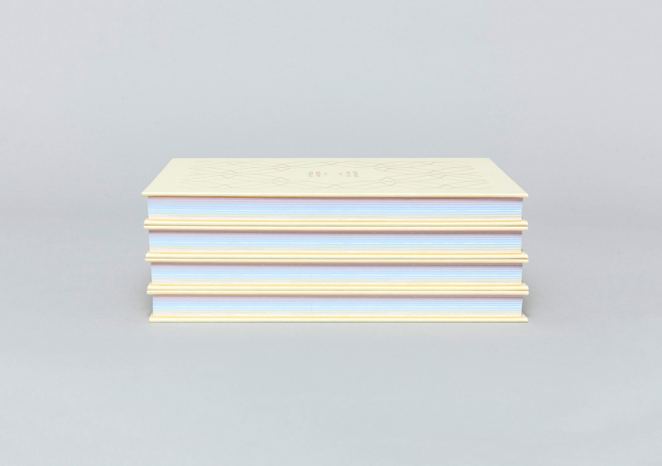

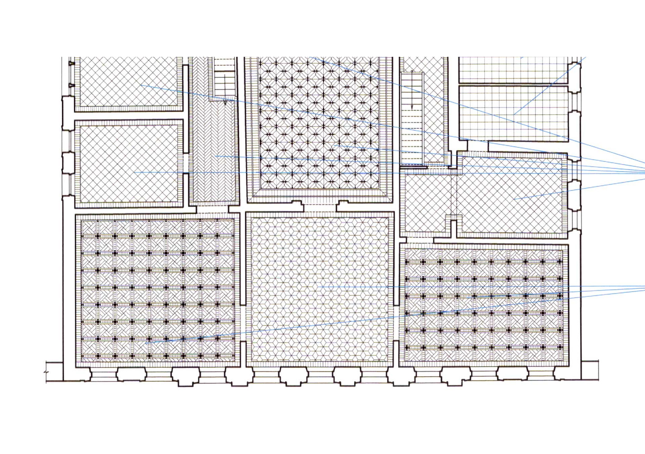
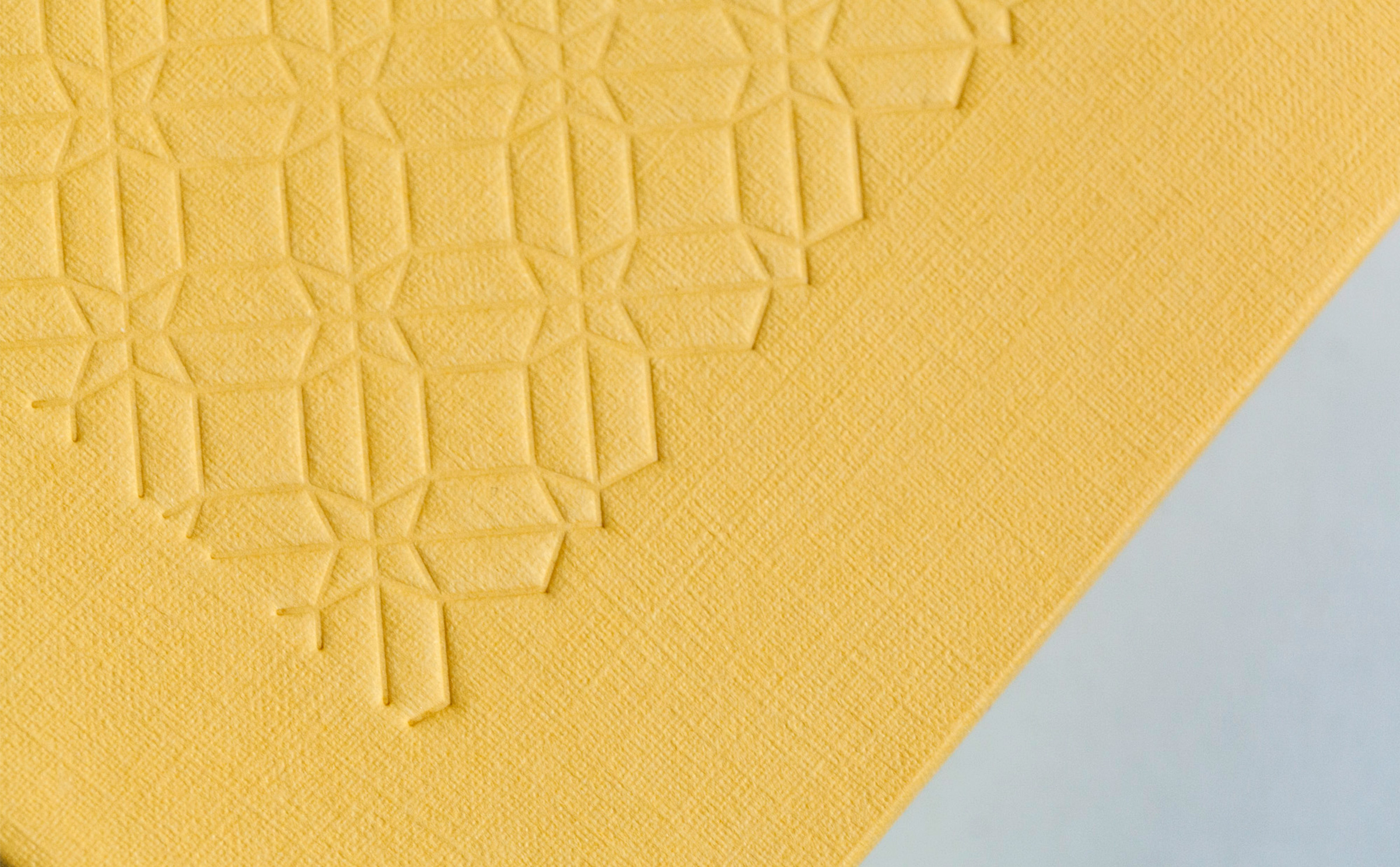
The patterns for the chapter pages and also the front cover and box were taken from the original intricate floor designs for the building.